7 Random forest classification
This sections produces all the figures used in Supplementary Figure 5.
7.1 Loading in data
After annotating the (2000ish) profiles using the shiny app from the previous section, we now load in all the metrics and remove sample/library names to not include that information in the training. Do note, because we recreate the RF model here, the results might differ slightly from the results and plots shown in the manuscript.
# Load in metrics and user classification data
metrics = fread("./data/RandomForest/metrics.csv")

# Set factor and remove sample and library information since we do not want to include that in the training
metrics[, user_quality := factor(user_quality, levels = c("good", "bad"))]
metrics = metrics[!is.na(user_quality), !c("sample", "library")]
7.2 Obtain training set and validation set
We used 80% of our data to train our model on and then evaluated the RF model on the other 20% of the samples that the RF model has not encountered during training. It is important to check that the distribution of good/bad profiles is relatively equal in training and validation set and is a reflection of the full data. If this is not the case you can rerun the sampling (you can also set a seed to ensure you obtain the same sampling results)
# Set size (in fraction of total) of the training set
size_training = 0.8

# Randomly sample the training set and put the remaining samples in the validation set
training_set = metrics[sample(.N, round(nrow(metrics) * size_training))]
validation_set = fsetdiff(metrics, training_set)

# Verify that the training and validation set have a good distribution of good/bad quality profiles (based on user annotation)
table(metrics$user_quality)[1] /
  (table(metrics$user_quality)[1] + table(metrics$user_quality)[2])  # ratio of good vs bad
## good
## 0.3793403table(training_set$user_quality)[1] /
(table(training_set$user_quality)[1] + table(training_set$user_quality)[2]) # ratio of good vs bad## good
## 0.3776451table(validation_set$user_quality)[1] /
(table(validation_set$user_quality)[1] + table(validation_set$user_quality)[2]) # ratio of good vs bad## good
## 0.38611717.3 Training the model
We trained the RF model with default settings since we obtained a high classification accuracy
7.4 Validating the model
Following the training we need to validate the models performance using the validation set. First we run the model on the validation set using predict and add columns with information about the predicted quality and the actual quality. Following this we plot the Receiver operating characteristic (ROC) curve and check the Area Under the Curve (AUC). Depending on randomness (or which seed is set) the curve and AUC can vary slightly. But in our experience it has always been >0.98
# Predict on validation set
prediction = as.data.table(predict(rf, validation_set, type="prob"))
prediction[, response := ifelse(good > bad, "good", "bad")]
prediction[, observation := validation_set$user_quality]

# Plot receiver operator characteristics curve
roc_curve = roc(prediction$observation, prediction$good)
ggroc(roc_curve, size = 1.2) +
  annotate("text", y = 0.1, x = 0.1, label = paste0("AUC = ", round(roc_curve$auc[[1]], 3)))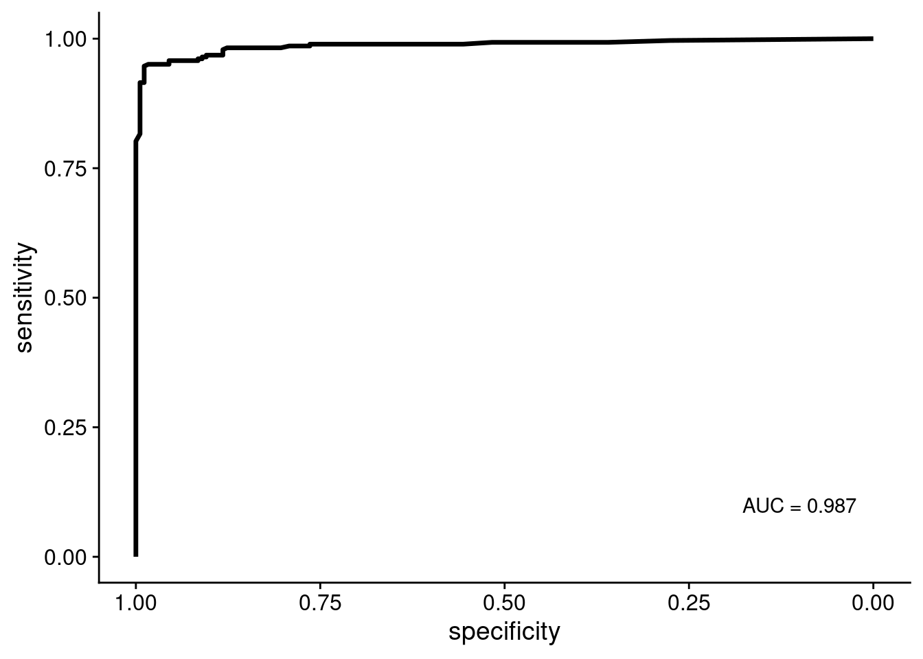
Next, we wanted to see which variables (sequencing/copy number calling metrics) are the most important for the RF classification.
# Get variable iomportance values
var_imps = data.frame(rf$importance)
var_imps$feature = rownames(var_imps)
setDT(var_imps)
setorder(var_imps, MeanDecreaseAccuracy)
var_imps[, feature := factor(feature, levels = feature)]

# Plot variable importances
ggplot(var_imps, aes(x = MeanDecreaseAccuracy, y = feature)) +
  geom_segment(aes(xend = 0, yend = feature), size = 1.2) +
  geom_point(size = 4, color = "orange") +
  labs(y = "Feature", x = "Mean decrease in accuracy")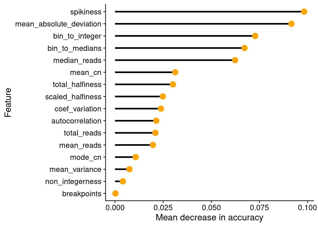
Finally, we calculate other measures such as the F1-score, Positive and Negative Predictive Value, etc.
# Calculate metrics using caret::confusionMatrix
confusionMatrix(factor(prediction$response, levels = c("good", "bad")), factor(prediction$observation, levels = c("good", "bad")), mode = "everything")
## Confusion Matrix and Statistics
##
## Reference
## Prediction good bad
## good 170 14
## bad 8 269
##
## Accuracy : 0.9523
## 95% CI : (0.9286, 0.9699)
## No Information Rate : 0.6139
## P-Value [Acc > NIR] : <2e-16
##
## Kappa : 0.9
##
## Mcnemar's Test P-Value : 0.2864
##
## Sensitivity : 0.9551
## Specificity : 0.9505
## Pos Pred Value : 0.9239
## Neg Pred Value : 0.9711
## Precision : 0.9239
## Recall : 0.9551
## F1 : 0.9392
## Prevalence : 0.3861
## Detection Rate : 0.3688
## Detection Prevalence : 0.3991
## Balanced Accuracy : 0.9528
##
## 'Positive' Class : good
## 7.5 Plotting number of cells that pass QC
Next, we plot the number of cells in the prostate samples that pass this RandomForest QC. First we plot Patient 3.
# Load all profiles
profiles = readRDS("./data/P3_cnv.rds")
annot = fread("./annotation/P3.tsv",
              header = FALSE,
              col.names = c("library", "section", "tissue_type"))

# Get number of counts per region
profiles$stats[, library := gsub("_.*", "", sample)]
counts = profiles$stats[classifier_prediction == "good", .N, by = library]

# Merge with annotation
counts = merge(counts, annot, by = "library")

# Add coordinates
counts[, x := as.numeric(gsub("L|C.", "", section))]
counts[, y := as.numeric(gsub("L.|C", "", section))]

# Plot
ggplot(counts, aes(x = x, y = y, fill = N, label = N)) +
  geom_tile() +
  geom_text() +
  scale_fill_distiller(name = "Number of cells\npass QC",
                       palette = "Reds",
                       direction = 1, na.value = "grey",
                       limits = c(1, 384)) +
  geom_hline(yintercept = seq(from = .5, to = max(counts$y), by = 1)) +
  geom_vline(xintercept = seq(from = .5, to = max(counts$x), by = 1)) +
  scale_y_reverse(expand = c(0, 0), breaks = seq(1, max(counts$y)), labels = seq(1, max(counts$y))) +
  scale_x_reverse(expand = c(0, 0), breaks = seq(1, max(counts$x)), labels = seq(1, max(counts$x))) +
  theme(axis.title = element_blank())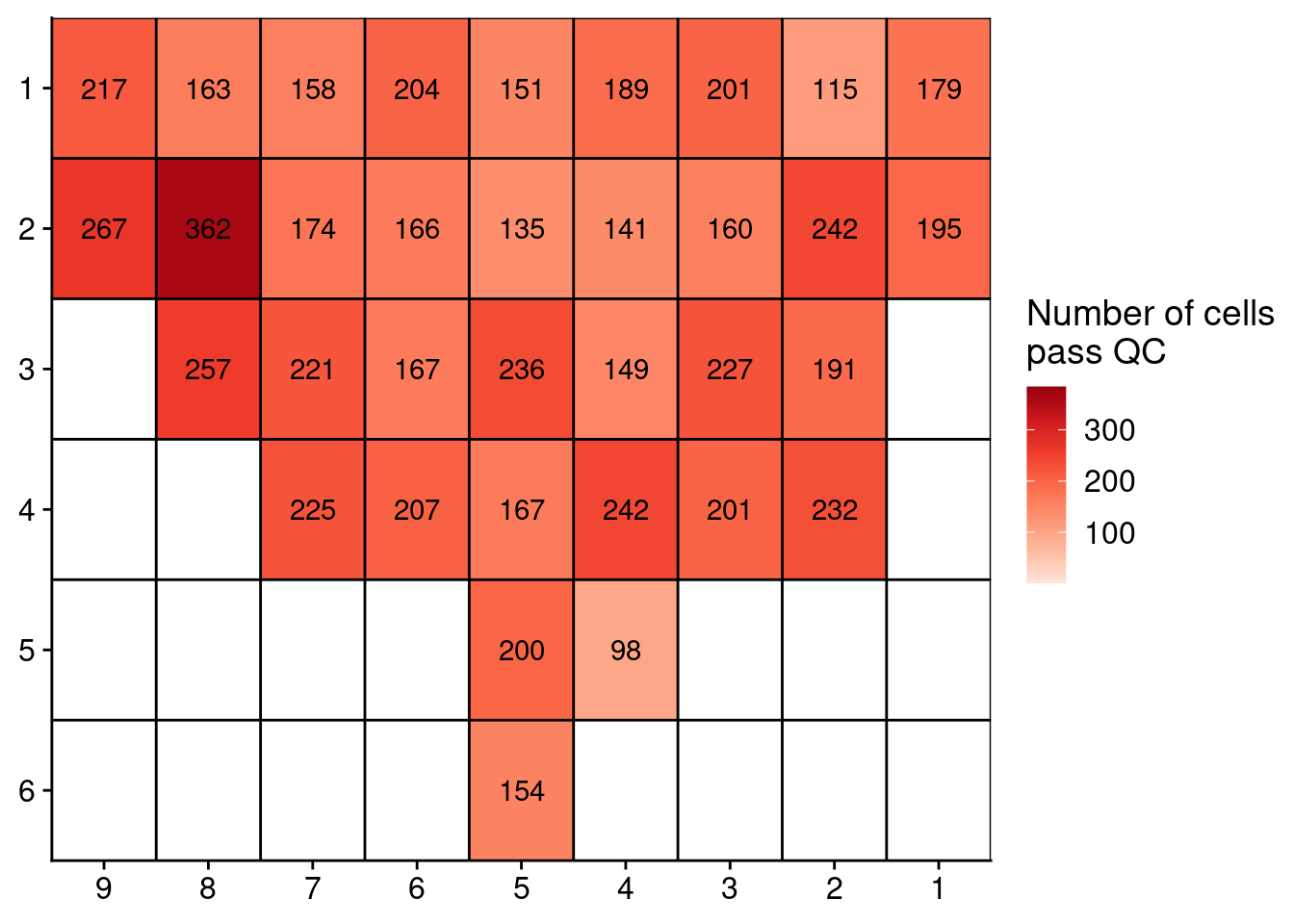
Now, plot the same for Patient 6.
# Load all profiles
profiles = readRDS("./data/P6_cnv.rds")
annot = fread("./annotation/P6.tsv",
              header = FALSE,
              col.names = c("library", "section", "tissue_type"))

# Get number of counts per region
profiles$stats[, library := gsub("_.*", "", sample)]
counts = profiles$stats[classifier_prediction == "good", .N, by = library]

# Merge with annotation
counts = merge(counts, annot, by = "library")

# Add coordinates
counts[, x := as.numeric(gsub("L|C.", "", section))]
counts[, y := as.numeric(gsub("L.|C", "", section))]

# Plot
ggplot(counts, aes(x = x, y = y, fill = N, label = N)) +
  geom_tile() +
  geom_text() +
  scale_fill_distiller(name = "Number of cells\npass QC",
                       palette = "Reds",
                       direction = 1, na.value = "grey",
                       limits = c(1, 384)) +
  geom_hline(yintercept = seq(from = .5, to = max(counts$y), by = 1)) +
  geom_vline(xintercept = seq(from = .5, to = max(counts$x), by = 1)) +
  scale_y_reverse(expand = c(0, 0), breaks = seq(1, max(counts$y)), labels = seq(1, max(counts$y))) +
  scale_x_reverse(expand = c(0, 0), breaks = seq(1, max(counts$x)), labels = seq(1, max(counts$x))) +
  theme(axis.title = element_blank())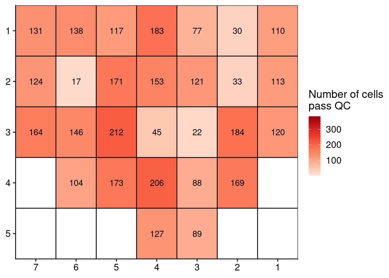
Next, we plot the number of QC-pass cells for the ACT and scCUTseq comparison.
# Load files
l9c1 = readRDS("./data/CD5p_cnv.rds")$stats
l9c2 = readRDS("./data/CD7p_cnv.rds")$stats
l8c1 = readRDS("./data/CD4p_cnv.rds")$stats
l2c2 = readRDS("./data/CD2p_cnv.rds")$stats
l8c2 = readRDS("./data/CD6p_cnv.rds")$stats
l3c4 = readRDS("./data/CD3p_cnv.rds")$stats

p7l3c4_cut =  readRDS("./data/CD27.rds")$stats
p7l3c4_act =  readRDS("./data/CD1p.rds")$stats

# Add information and rbind
l9c1[, library := "L9C1"]
l9c2[, library := "L9C2"]
l8c1[, library := "L8C1"]
l2c2[, library := "L2C2"]
l8c2[, library := "L8C2"]
l3c4[, library := "L3C4"]
p7l3c4_act[, library := "P7L3C4"]
p7l3c4_cut[, library := "P7L3C4"]
p7l3c4_cut[, method := "scCUTseq"]

act = rbindlist(list(l9c1, l9c2, l8c1, l2c2, l8c2, l3c4, p7l3c4_act))
act[, method := "ACT"]

# Load scCUTseq
sccutseq = readRDS("./data/P3_cnv.rds")$stats
annot = fread("./annotation/P3.tsv",
              col.names = c("lib", "library", "Pathology"))

# Extract scCUTseq libraries
sccutseq[, lib := gsub("_.*", "", sample)]

# Merge with annotation
sccutseq = merge(sccutseq, annot, by = "lib")
sccutseq_subset = sccutseq[library %in% c("L9C1", "L9C2", "L8C1", "L2C2", "L8C2", "L3C4")]
sccutseq_subset[, method := "scCUTseq"]

# Combine all data
total = rbindlist(list(act[, .(classifier_prediction, library, method)],
                       sccutseq_subset[, .(classifier_prediction, library, method)],
                       p7l3c4_cut[, .(classifier_prediction, library, method)]))

counts = total[classifier_prediction == "good", .N / 384, by = .(library, method)]

ggplot(counts, aes(x = method, y = V1, group = library)) +
  geom_point(size = 3) +
  geom_line() +
  scale_y_continuous(limits = c(0, 1), labels = scales::percent_format()) +
  labs(y = "Percentage of\nhigh quality cells", x = "Method used")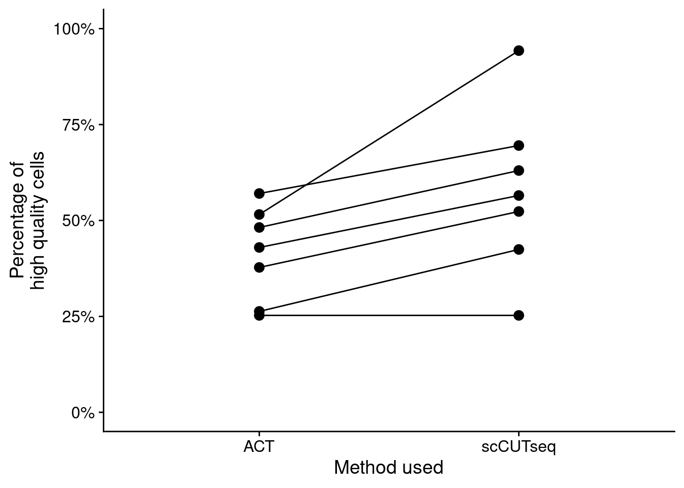
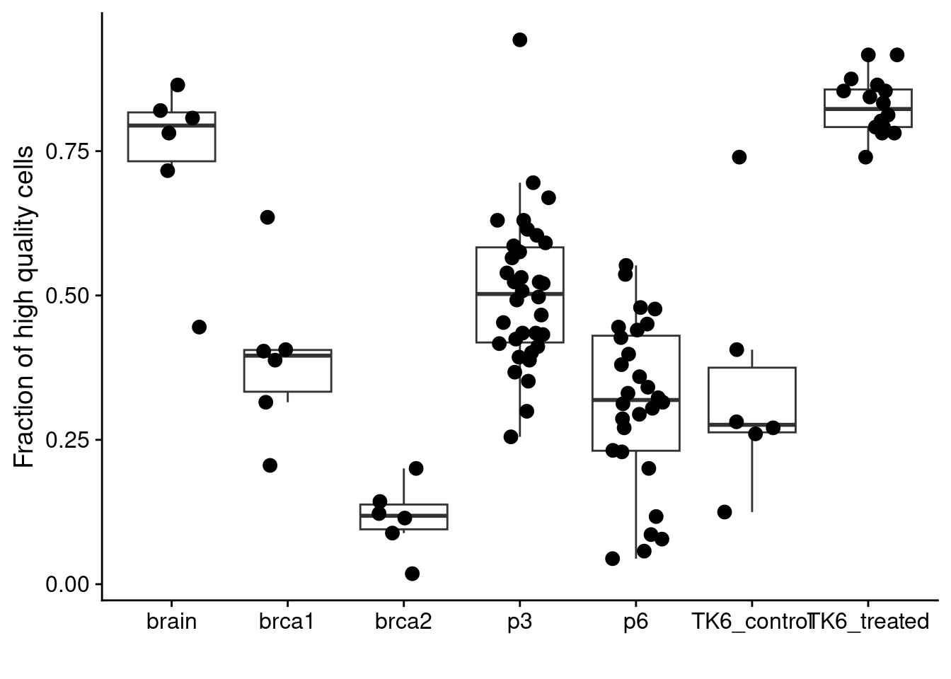
Finally, we plot the number of QC-pass cells in different samples.
# Prostate
p3 = readRDS("./data/P3_cnv.rds")$stats
p6 = readRDS("./data/P6_cnv.rds")$stats

# BRCA
brca1 = readRDS("./data/brca1_cnv.rds")$stats
brca2 = readRDS("./data/brca2_cnv.rds")$stats

# Brain
dg20 =  readRDS("./data/DG20_cnv.rds")$stats
dg21 =  readRDS("./data/DG21_cnv.rds")$stats
dg22 =  readRDS("./data/DG22_cnv.rds")$stats
dg33 =  readRDS("./data/DG33_cnv.rds")$stats
dg39 =  readRDS("./data/DG39_cnv.rds")$stats
dg40 =  readRDS("./data/DG40_cnv.rds")$stats

annot = data.table(library = c("dg20", "dg21", "dg22",
                               "dg33", "dg39", "dg40"),
                   celltype = c("neun+", "neun-", "skmuscle",
                                "neun-", "neun+", "skmuscle"))

# Prepare brain samples
dg20[, library := "dg20"]
dg21[, library := "dg21"]
dg22[, library := "dg22"]
dg33[, library := "dg33"]
dg39[, library := "dg39"]
dg40[, library := "dg40"]

brain = rbindlist(list(dg20, dg21, dg22, dg33, dg39, dg40))

# Preare brain and prostate
p3[, library := gsub("_.*", "", sample)]
p6[, library := gsub("_.*", "", sample)]

brca1[, library := gsub("_.*", "", sample)]
brca2[, library := gsub("_.*", "", sample)]

# Loop through samples and get counts
list_samples = c("p3", "p6", "brca1", "brca2","brain")
res = lapply(list_samples, function(sample) {
  dt = get(sample)
  counts = data.table(sample = sample,
                      dt[classifier_prediction == "good", .N, by = library])
  counts[, fraction := N / 384]
})
res = rbindlist(res)

# TK6
tk6 = fread("./data/tk6_hq_stats.tsv")

all_counts = rbind(res, tk6)

# Plot
ggplot(all_counts, aes(x = sample, y = fraction)) +
  geom_boxplot(outlier.shape = NA) +
  geom_jitter(width = .25, size = 3) +
  labs(y = "Fraction of high quality cells", x = "")